GRADE 11

What I Did This Summer
Photoshop
The collage assignment was mostly an opportunity for us to gather our interests and personal values into one big picture that I like to call a “get together”. For me, it was something else. Because I couldn’t let it go yet, I decided to take all the hype of what I did this summer and pasted them all onto one big photo. I was very eager to do this one. I even drew TWO rough drafts for this collage both small and large. Over the summer, I went to Paris, Disneyland Paris, Fan Expo, London, the Military Communications and Electronics Museum and so much more. The biggest principle I can think of for this piece is Duration. When I planned this picture, I put in at least 30+ pictures to put in. And this leads to one of the collage’s weaknesses: the layers. Because I chose things like the Tower Bridge and Notre Dame, I had to zoom in on every pixel and make sure not a slice of the background was left. Tower Bridge was probably the hardest for me. The other problem is that because I spent so much time on this which lead to being overdue, I couldn’t get in the final product I had in mind. Aside from that, I’m impressed with how this turned out. Everything in the picture is neatly organized and arranged. My favourite elements in the picture include the Vimy Ridge statue connecting the Big Ben and LEGO Harrods, the Eiffel Tower, The Hollywood Tower Hotel of Terror, A picture of me when I met Zach Galligan from Gremlins at Fan Expo and the dragon on the Sleeping Beauty Castle. Even though I didn’t get what I quite had in mind, I enjoyed editing this picture.

Scottish Umbrellas
17 x 11
This was what I handed in for my colour wheel assignment. Here, you see two cute little Scottish terriers (there is 8 in total) under an umbrella which the source came from a bag I found when I was in Harrods during my trip to London. In all four pictures, they are standing in rainy environments with other things related to the situation including Mary Poppins, Kermit the frog, gusty clouds and of course, Singing in the Rain. But the real point of this piece is to showcase at least four of the many colour schemes we take for granted in not just media arts but art in general. The top left is primary (RYB), the top right is secondary (PGO), the bottom left is analogous (red, red orange, orange, yellow orange) and the bottom right are cool colours. Personally, while I am glad I chose the dogs since they are cute and it does add that to the picture, using the elements of rain every picture just shows that it was all I could pick from the book and little to any other creativity was lost. But I’m still glad I made it and I plan to think much more fluently for later projects.
.

The Federal Stooges
11 x 17
This is what I made for a tutorial on masking. And with the 2015 federal election in 9 days, I decided to choose that as my theme. Here, you see Thomas Mulcair with the Canadian flag painted on his face with Stephen Harper standing on his shoulder and Justin Trudeau’s cheesy grin leaning in on the picture. In the background, you can see the lyrics to O Canada and a very faint image of Parliament Hill. I used a variety of blending modes and masking tools for this project including Linear Burn, Hard Light, Soft Light and for masking, I used a black and grey paintbrush to hide away layers I did not need in this piece. I had lots of fun this one especially because I was originally going to just have Mulcair but then I decided it would be even better with his opposing candidates (Sorry I left you out, Green Party) and my favourite part was editing Harper on Mulcair’s shoulder as if he was annoyed by him. And the blue tint really adds to that.

Hybrid Portrait
17 x 11
This was the project that I crafted and made for the hybrid portrait assignment. For the elements in this picture, I went out with my Dad to get a snapshot of the Rideau Canal as seen from the Kingston Lock Mills. My portrait comes from when I went with Jordan to get my picture taken with Lance Henriksen (Bishop from Aliens) during Ottawa Comic Con this year. The dog is my own named Chewy who is a chihuahua terrier. The rest of the images and doodles (which I drew and coloured on own) are not my own creations but rather reflect my hobbies in movies and games. The biggest challenge was once again duration and erasing all the negative layers. But other than that, I enjoyed making this piece. My favourite parts of the picture are the invisible Predator (next to Chewy and above Sceptile, a Pokémon) and his counterpart, the Xenomorph, Godzilla (next to the Xenomorph), Ganondorf (man on the upper left corner in the trees), the Rod Serling quotation from the Twilight Zone and the Gremlin bursting through the portrait as well as cute little Gizmo. The other characters next to each other are Anger from Inside Out and Gipsy Danger from Pacific Rim.

A Time to Remember
17 x 11
For this project, we had to make a photomontage that reflects on Canadian War history and to honour our fallen heroes for Remembrance Day. This is what I handed in. Unlike for my other projects where I made a rough sketch that I would use to determine for where the layers go, I did not make one for this assignment. For this piece, I found an image of a poppy field spread out and then, I put in the Tomb of the Unknown Soldier in Ottawa. Then, I put the War Museum in the back and after that, some soldiers, a tank and a soldier’s grave. My favourite part was making the soldier’s grave and the tank blend in with the poppies, but it was also the biggest challenge in this project. Also, because the tomb in the Tomb of the Unknown Soldier picture was blocked by someone and an officer, I had to use a snapshot of the tomb at a closer angle. But before that, I tried to make the monument blend in with the gardens which I tried to hide with the closer pic of the tomb but it wouldn’t look right up high so I tried to match with the helmet that is visible at the far angle picture. Aside from that, my other favourite part about this piece is the ghost effect I made with the Canadian soldier in front of his tomb as well as the Navy and a US veteran saluting him. I also thought the War Museum gave a nice aesthetic and the lyrics from We’ll Meet Again fits perfectly to the context of this work.
These were just tiny bits of practicing I did for using Adobe Illustrator. For this project, it was about typography. We did things like write our names, five adjectives, random words and then toyed around with them by colour changing, and changing the fonts. We also used a pen and tablet the draw images and added some detail to most of the words we spelled out. As you can see, I am not really the best at using the pen and tablet but I think I did a okay job on this project. The part I enjoyed the most was writing my name in a spiralling circle and the least was using the tablet to doodle on the word skeleton. I also enjoyed the part with the Wes Craven quote and making the gradients resemble Freddy Krueger’s sweater. Hopefully in the future, I’ll get another chance to use Adobe Illustrator so I can make better works of art with more precision.
The second task to introduce Abode Illustrator was to create a series of posters that demonstrate we know about typography. A chance to use our creativity, send a message, and our artistic sense to create an interesting and effective design. I choose to do three posters for this project even though we didn’t have to multiple ones. First poster I came up with on my own, quote wise: “Don’t be a chicken, be an eagle” You know, being brave and all that. The other poster was once again, Rod Serling. And the last one was Squidward from Spongebob Squarepants. The first poster I definitely had fun with using my words and illustrating the wings and beaks on “eagle”.The second one I liked adding the starfield image in the background and I liked how having the word “mind” in the silhouette head turned out. I really enjoyed drawing the eye as well. The third one was a little rushed and could’ve had more time to work on (I was gonna edit the photo on Photoshop to just have Squidward shown and then transfer it over to Illustrator, but time got the best of that). Anyway, I am still proud of this project and I definitely would love to use more of Illustrator again.

untitled – Barbara Kruger
4.25 x 5.5
This was the project I did for the Barbara Kruger assignment. For this assignment, it was about the artist, Barbara Kruger, who did things like make artworks addressing social issues (human rights, war, bullying, eg.) with sarcastic quotes that are ironic to what is going on in the picture. The text is usually in sans serif and is accompanied with red sometimes. For this piece, the issue I decided to address was drinking and driving. It’s a serious issue because in Canada, 4 people die on average every day due to drinking and driving and if you’re responsible for the “accident”, you could not only get your license suspended, you can also get sent to jail for it. For this project, I used both Photoshop and Adobe Illustrator. Took me two days to work on and finish. For Photoshop, I found an image of a wrecked car and later, I painted the background in black to make it look like night time and I also put a black and white filter on it. Then, I edited a broken bottle under or near the car. I made the red rectangles using the shape tool. On Illustrator, I drew a puddle of blood (or could be alcohol) and red and blue circles overlapping each other which are supposed to be police lights and the text is all done by incorporating the text on a red rectangle which all three I transferred over to Photoshop. The final result is nice. At first, I was a little skeptical of this project, but in the end, it turned out to be a nice piece. The influence for my piece comes from the red borders and bars Barbara uses to crop her artwork as well as the Sans Serif typeface she uses. I came up with the “One more drink couldn’t hurt me?” with a little help from Alice Longtin. I chose it because it adds to the irony of assuming that you’re OK to drive under alcohol even though it impairs your coordination and skills which eventually leads to fatality. For more information on this issue and my research for this project check out these these links.

Clark – Painting Practice
8 x 8/RGB
This is a practice I made for our next unit: digital painting. For most of us, we found an online image of a fruit and did a copy sketch of the image with pen and tablet. Then, we used the eyedropper tool to replicate the colours used in the image and made swatches of them. Then, we put them on on the sketch. For my project I did a banana. Didn’t take me too long to do and I had no real trouble other than getting the right colours. That said, I can’t wait to get on our digital painting assignment.

Example Animation – Rocket GIF
250 x 250 and 30+ frames
For the animation unit, this is a practice tutorial we all had to do where we made a rocket fly up to the air and have something happen. To make rocket move, I duplicated the layer multiple times for rotating and turning around. To make the numbers and letters squish, I also made copies of them and used the puppet tool to make them look squished. Then, I made a short explosion effect with the brush tool and added in a text saying “Oh fudge” before the crash effect ending with the credits; And then they all died. The End. I had lots of fun making this practice even though not much time was given.

Google Doodle – Twilight Zone
800 x 500 and 12 frames
The Google Doodle was the second instalment in the animation unit where where we had to create an animation illustrating a historical moment or the anniversary of an important day or thing. For this project, I decided to re-enter… the Twilight Zone. (cue the music) As for making this piece, I did it all with using only whites and blacks with a little shade of grey with a starfield as the background. The most easiest part was the ‘G’ and the “e-mc” letters as well as copying the spiral layers for each frame. While the pupil and door frame were on one separate layer, the eyelids and the door itself were all animated frame by frame. The eyelid had 4 while the door had 3. As for the doll itself, it was a still frame while the hair I drew on tablet (which was the most hardest part at the end) For ending the GIF, I just reused the same layers I had drawn earlier but played in reverse, I reused at least two hair strands for the end and I had to keep duplicating the spiral sphere. At first, I thought this was gonna be a challenge, but in the end I actually enjoyed making this Google Doodle and I wish I get more opportunities to make cartoons in the future.

AT-AT vs Snowspeeder
17 x 8.5
Photoshop and Illustrator
For my culminating, I wanted to make a painting-photography hybrid based off the “Battle of Hoth” scene from The Empire Strikes Back. First thing I did was take some Star Wars miniatures and toys from my collection which I took to the park in my neighbourhood with my Dad. I placed them on the hill which still had snow and took pictures of them at different angles. Some of the models were bigger and smaller than the others and I made some test shots just in case. Then when I got to school, I started planning by sketching and drafting in my sketchbook with all the stuff I need and where they will go. Once that was done, I hopped onto Adobe Illustrator to start drawing the background. I used a screencap from the movie as well as the eyedropper tool to capture the look of Hoth’s icy landscape and the mountains. Took me days and after school breaks to do but once it was finished, I went onto Photoshop where I took a primary photo of the AT-AT and erased out all the background so it would contrast with the background. I did the same for the Snowspeeder that was going up against it. Then, I made two seperate projects for another Snowspeeder as well as a mirrored Snowspeeder and an AT-AT that looked like it had been tied up by the harpoon gun. Each of these toys were differently sized so I had to edit them to make them look equal together in the picture. Once all the components were in the picture, I did touch ups like fill in some of the blanks in the painting that were left during transfer and take out any background layer that was left behind. I also tried to make the snow look like it was being imprinted into the AT-AT’s feet by creating lumps around them. The laser effects were also done on Illustrator with a movie screenshot and the eyedropper tool for the color. I was gonna try and make a shadow effect with the AT-AT’s but I wasn’t too happy with most of the results so I just left it. I decided to wrap it up and then hand it in digitally to my teacher. Alas, it was too late to print it out so for presentation, it had to be on the smartboard. While this project was frustrating to make and hand in on time as well lots of time spent during lunch and after school, I still had fun with it and I am actually happy with the final product. I also love the saturation of the Snowspeeder and AT-AT which are all blue-grey just like the background. It will be pretty sad for me once media arts is over because I enjoyed this class and I hope I can take it again next grade.
GRADE 12
CD/Album Case


The Beatles: Yellow Submarine
For our first assignment in Grade 12 media arts, we had to make an imaginary album cover for a famous band and musician. The one that I choose to do was The Beatles. First thing I did was I took photos of the LEGO Ideas Yellow Submarine set that I had at home along with the Beatles minifigures themselves. Then at school, I went onto Photoshop to work on the front side. To start off, I applied a psychedelic image to the background so it would fit the Beatles’ style. I also adjusted the contrast and brightness so it would stand out. Then, I put in a rainbow image along with two stars at each end. Next up, I put in the Yellow Submarine itself and erased all the wall borders around it. Then, I put in all four of the Beatles members from John Lennon to Paul McCartney, George Harrison to Ringo Starr. After that, I drew a blue banner shape where the words “Yellow Submarine” would go on and the name for the band went on the rainbow. For the back cover, I chose the background to be a clouded sky. Then, I put in the minifigure of Jeremy Hillary Boob Phd. holding an apple. The last few things I did were typing in the names of the songs from the original soundtrack, putting the band and album name together on the top, and adding in a barcode. I was very proud of how this project turned out since I am a big fan of LEGOs and I love the Beatles music.
This was the piece that I handed in for my Biblical Poster assignment. What I did for the assignment was that I hopped onto Adobe Illustrator. Then, I drew a vast majority of shapes in different colours and sizes. When that was done, I applied a passage from the Bible to go over the background which said: “An eye cannot say to the hand ‘I don’t need you!’ And the hand cannot say to the feet ‘I don’t need you!'” a reading from 1 Corinthians 12:21. I also drew the cross of Jesus Christ so it would look religious. I had a lot of fun drawing the colours all over this poster, but this assignment isn’t one of my most favourites.
Portrait Assignment

Sketchbook Scan
First step of the assignment was to take of a photo of ourselves using a camera. After that, the picture was imported to Photoshop so it can be desaturated into black and white. Once it is done printing, we then trace a drawing of it into our sketchbook where it is then scanned not our computer for the next step.

Curved Version
Next step was to go into Adobe Illustrator where we had to make a digitally enhanced version of the picture using the Pen tool. We had to draw curved segments that match along the lines. When the anchor point is closed, we then fill in the gap making a new shape that overlaps the drawing. For my portrait, I filled it in with black entirely. I felt that this would make it easier than having to close the anchor points around the white areas which I found way too challenging to continue.

Angular Version
Angular shapes were made to fill in the lighter portions of the face by filling it in with white colours. Tons of angular shapes were used for highlighting the hair strands. It was really easy to get the white shapes by disabling the black layers so I could see where I could connect the dots on the anchor points.

Photoshop’s Version
For the final step, we went back onto Photoshop where we deactivated the desaturation feature on the photo and bumped up the contrast down to two where it made it darker.
My most favourite versions of these photos are the angular version of the photo because of how much effort it acquired to complete and the Photoshop one for its pizzaz and vividness.
Gel Transfer
Instead of manipulating and distorting images online in Photoshop, what we did for the gel transfer assignment was transfer images cut out from magazines, books, printed off the computer, etc. and placing them down on a canvas sheet using gel. These are a few examples:

Red, Blue and Yellow
This was my first practice at the gel transfer thing. I started off by painting the entire thing blue. Then, using a circle pattern tray, I painted in a row of little yellow dots. Las thing I did was paint a red cross hatch pattern using a fishnet.

Tarnished Nature
This one was very challenging to do. Using a floral design, I cut out several fragments of the design and placed them face down on the canvas with gel transfer. The problem was that the pictures wouldn’t show up well. I tried rubbing water on the paper so the images would stick out more, but most of the time I ended up ripping the paper off. So, I had to glue some of the pieces back on and I filled in the gaps with aqua-green paint.

Mishmash
As the title says, this last bit of practicing was a mishmash of materials. I painted the entire canvas pink, glued some jewelry onto it, and painted a play button in blue and a football and stars in green using a grid sheet. This one was pretty generic to me.

Werewolf in the Forest
For my final piece in the gel transfer unit, I decided to make it a big one. My painting would be a werewolf lurking in some haunted woods. I first started by grabbing some grey and brown paint colours that I mixed together to create the ghoulish, grey scenery present in this artwork. When it was done, I painted in some trees using brown paint using dark ones for the front and lighter ones tucked in at the back. I painted in some twigs on the ground as well to make look really dingy. The foreground was painted completely black so it would contrast against the greyness and make the woods spooky and unwelcoming. For transfers, I cut out a flower out of a magazine and placed it face down on the paper. This indicates that there is still some beauty left in this forest. I then glued a cut out image of a clock at the top of the canvas to show the time as well as symbolizing the full moon. I also painted three red scratch marks to imply how savage and deadly the feral beast is. The last, but not least step was the werewolf. I started off by drawing what the werewolf would look like in my sketchbook. Then, I printed several copies of my drawing until I got the right size (and I used the photocopier because my prototype is too good to use.) Right after applying the gel transfer on it, I placed it down face first and left it there to dry for the day. When that was done, I rubbed it wet with water so I could fill in the lines with my paint. While I definitely do love this piece along with my werewolf design, I felt disappointed throughout this unit since my attempts at gel transfer end up becoming a mess.
DEVICE GELASKINS
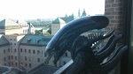
For one of our last assignments, we had to make an original design that would end up being applied on mobile devices such as iPhone, Samsung and a laptop. The design had to be original and something that would be popular today. I decided that my theme would be from the Alien movies.
Alien
GELSKIN DESIGN
Starting right off the bat with the design itself, I went on to Adobe Illustrator and drew a star field with a black sky and white stars surrounding it. Just so it wouldn’t look boring and generic, I drew a swirly blue nebula around it so it would look appealing. Next thing I did was drawing the egg from the original Alien poster that I used as a reference for the colours. Then, I took a photo of a Xenomorph toy that I own at home and erased the edges around him so he would fit onto the backdrop. Last thing I did was writing the word “In space, no one can hear you scream” at the bottom.

iPhone
The first device that I attached my design to was the iPhone. This was very easy due to the Gelskins templates that were offered by the website, but the design proved to be a challenge since half of the original design was skewered by the iPhone’s size. So, what I did was I rearranged the original design by moving the Alien and quote to the right side and I moved the egg to the left side. I also had to shop out the white marker line that was on the right side of the original picture.

Macbook
Not much else to say about the MacBook version except that unlike the iPhone design, the original design fit with the shape of the MacBook computer.
PANTHER TECHNOLOGY POSTER
For our last assignment, we had to make a poster involving our school mascot which is a panther, and it had to be about using technology. This is my take on the fray.

PANTHER KNOWS
For my assignment, I decided to do things a little more differently than using photos of the school mascot. What I did at home was I got out my old iPod, a black panther toy and my sister’s dollhouse beds. I tucked the iPod underneath the bed sheets and I placed the black panther on it as if he is sending it to bed. Then on Illustrator at school, I drew several of the slogans I would be using for my poster such as “PANTHER KNOWS WHEN ITS TIME TO TAKE A NAP” and “A MESSAGE FROM RND”. To fit in with the school’s theme, I drew the words using the school’s primary colours: garnet and gold. After they were drawn, I would save them as a PDF where they could be transported over to Photoshop for manipulation. I also drew a little “ZZZZ” line in Illustrator and placed it over the phone in Photoshop so it would indicate that it was sleeping. I had a lot of fun editing and playing around with this one. I am really glad it didn’t take me too long to do unlike the other assignments in this class.

“PANTHER KNOWS WHEN IT’S TIME TO GO TO BED OS 2.0”
This is an alternate version of my poster where we had to put in the slogans saying “THIS IS PANTHER”, followed by the message of the poster and then ending it with “BE MORE LIKE PANTHER!” Personally, I like my first edit more.

Gremlins Poster
While not the last assignment I did for media arts class, this project that I handed in for culminating is the most important. For years now, I have been a huge fan of both the movie Gremlins and an artist on Flickr named David Eger. He is a photographer who specializes in photographs of Star Wars toys and has an entire series called 365 Days of Clones. I decided that my culmination would pay tribute to his art style and my design for this culmination was decided as an imaginary poster for the movie Gremlins made by me. As usual, the first thing I did was take photographs of two Gremlins toys that I own at home for the big poster. Then at school, I hopped onto Illustrator and drew a background consisting of a black backdrop and gradient shades of grey and white. I also painted the sun, drops of water and a chicken leg which symbolize the three rules that one must follow when taking care of a mogwai in the movie. I then opened a canvas on Photoshop which is where I placed the backdrop. The next step was me placing the Mohawk gremlin onto the backdrop and played around with his size so he would look towering and scary. I erased all the wall borders around him until the frame was completely clean. Next image I placed was Gizmo the Mogwai who I made smaller than Mohawk and placed him in front of. Gizmo was a lot more easier when it came to erasing the borders than it was for Mohawk. Since the Mohawk i had in the picture was a spider hybrid, I placed a picture of another figure I had of the same character, but with legs. I erased everything near the waist and then matched it up with Mohawk’s body. The hardest part was trying to blend the colours between Mohawk’s torso and legs since they both have completely different paint jobs. When that was done, all I had to do was type in the slogans “What you see isn’t always what you get” along with “Steven Spielberg Presents”, the movie title and another slogan saying “Follow the rules”. Out of all the projects I’ve done this year in this year’s media arts class, this is the one I am the most proud of and I am going to miss this class.
If you want to see David Eger’s portfolio on Flickr and some of the work he’s done, check the URL link below:


GRADE 13

The Dark Knight Watches
Colin Clark
Photoshop
17 x 11
Here is my artwork that I handed in for the photo composition assignment. This photo shows the fictional comic book superhero Batman, along with his car, the Batmobile parked on a road, looking over New York City with the Batsignal in the skyline, used as a method of contacting and summoning Batman in a time of need. Every snapshot in this composition was taken all on my own. The dark, grey skies and Batsignal in the background were drawn by me in Adobe Illustrator. The night clouds were based off the night sky I saw in New York and The Batsignal was modelled after the one seen in Tim Burton’s movies. The skyline of New York City was taken on a nightly boat ride in Hudson River with my family during the summer of 2017. The picture of the 1989 Batmobile was taken at a comic book store named Woodbridge Heroes in Woodbridge, Ontario and The picture of Batman I used was a small action figure based off his appearance in The Dark Knight Rises that I own at home.
The reason I wanted to do this artwork was because I like taking small, extraordinary toys and putting them into ordinary settings which could never happen in the real world. I am really impressed with how shiny the Batmobile looks with the lightning and being able to match with the dark contrasts of the New York City skyline. I wish I was able to make Batman stand out brighter while still keeping him dark at the same time. Other parts I was satisfied with were the night clouds and Batsignal.

Evil Wizard
Colin Clark
Photoshop
23 x 11
For the digital painting assignment, I wanted to draw an evil wizard dressed in red, standing in pitch black as flames engulf around him. The inspiration for this concept and character came from an official LEGO minifigure of an evil wizard dressed in crimson red robes with a flaming staff and long beard. It was my duty to make a realistic, fantasy style drawing out of that toy.
First objective of mine was drawing the outlines of the wizard from his head to his body, and his staff to his hands. The sorcerer’s capes were painted in black and dark crimson. His outer robes were painted in dark red with golden flames around the edges to make it stand out. The sorcerer’s inner robes were coloured in bright red with a brown sash and a golden skull in the middle. Staying true to the toy’s attire, I added dark skulls all around his robes so it wouldn’t look plain. When I painted his skin, I made sure he had many tones and highlighting around the nose so his face wouldn’t look plain. I also gave him squiggly lines across his forehead and ghoulish cheekbones to make him look old and withered. The sorcerer’s beard was colored black and grey with grey outlines indicating where his moustache is. I added tons of shading and squiggly lines in his hands so it wouldn’t look bland. For his staff, I painted it black all the way up to the top with shades of grey and white thrown in to make it stand out. For the top of the staff, I drew and coloured in a ball of flame coming out of the torch using orange and yellow colours. Last thing I did was the background. I was originally thinking of having him stand behind a cult symbol, but felt that would have been very risky. So in the end, I decided to have stand behind an inferno of flames. I didn’t want this vortex of fire to be another batch of generic orange and yellow colors, so I added some red and yellow-orange colors onto my background flames to contrast with yellow and orange. Finishing touches I made were adding transparent red hues to the background and the floor along with a dark shadow for the wizard.
It was fun drawing the wizard and bringing him to life with the colors. I liked drawing his bushy eyebrows, red eyes and the scar along his face. I really enjoyed drawing the little skulls on his robes and using so many variants of red on his clothing. The most challenging parts for me were coming up with a neat background design, drawing the skulls in a diagonal pattern, making sure the colors in a layer I was coloring in didn’t go over the other and how long it took me to finish this painting. Much less to say, I really enjoyed making this painting and I look forward to making more realistic drawings of official LEGO minifigures again
TYPEFACE
These were practice pieces we did for the typeface unit. On Adobe Illustrator, we did six drawings for each topic; objects that represent a word, drawings that represent an action word, drawings that represent emotions, objects that imitate the shape of the first letter in its name and a drawn recreation of a company’s logo. My most favourite results of this experiment were the emotions, the “B” bear and the Boards of Canada logo recreation.
Colin’s Logotype Assignment [Recovered]
For the real assignment, we had to make a logo for our art websites that summarize what our work is about. My logo summarizes my work by showing all my favourite objects and hobbies. My title was “COLIN’S CRAFT WORK” and I made each word different with font types and theming. “COLIN’S” used the font of the title in the movie “Aliens” which was very fun to replicate and easy since it’s thin lines. It was fun to recreate the glowing “I” letter and a Xenomorph head was drawn to reel it in. The theming for “CRAFT” was toys as all the letters were made out of LEGO blocks with the RBY colour scheme and a teddy bear hugging onto the “C” letter. The LEGO blocks were easy to do with the shape tool and I could copy & paste blocks I had already done as well as changing the colour for different ones. The teddy bear was very cute to draw and I gave it different tons of shadings in its plushie fur. I didn’t have enough time to draw the studs that go on top of the LEGO bricks. Finally, the “WORK” theming was Star Wars. The chosen font for the word was the classic yellow font used for the “Star Wars” titles in every movie and I added a silhouette of the X-Wing starfighter to really let it rain in. Line streams were added underneath to make it look like it was really flying. I wish I was able to add more intricate detail to the X-Wing. Drawing the Star Wars font was really easy though.
Graphics Interchange Format


In the beginning of our GIF unit, we had to make three tutorial animations for three different topics: moving shapes, using the puppet warp tool and animating our name. For the shape practice, I made a ball that bounced back and forth. I colored it orange and it gave it an evil smile which looks like the Grand Doomer from Kirby’s Return to Dream Land. I also added diagonal lines and poof streams to give it a sense of movement. This assignment was relatively easy to do with the tween tool. For the puppet warp practice, I animated a puppy dog wagging it’s tail. I modeled the dog after my pet chihuahua terrier named Chewy. Puppet warping his tail didn’t take long, but it was very hard to do. The name animation required a lot of creative ways to spell it out. The C letter looks like a mouth with crooked teeth sprouting out, the O letter looks like an iris complete with eyelid, the L letter is just two lines forming with each other, the I letter appears in a black hole and a tiny letter N comes falling down from the sky. Then in the end, a blue curtain swings by dragging everything offscreen and unveils the C from the beginning. It was very challenging to do on my MacBook pro since I had no tablet, but it looks great in the end.

Pennywise Attacks
Colin Clark
17 x 11
Animated GIF
For my final GIF assignment, I decided to make an animated image of Pennywise the Dancing Clown from the new IT movie based off Stephen King’s novel. My GIF was modelled after a scene from the trailer which starts off with a red balloon in front of him which floats up to reveal the clown’s face looking at the viewer giving them a creepy smile. After that, his face turns into a menacing one with crooked teeth and messy hair as the balloon floats away quickly. The clown then reaches his hands out towards the screen as he attacks whoever is facing him and as he gets closer, his mouth gets more and more deformed with jagged fangs and we multiple beams of light in his mouth which are known as “deadlights” The deadlights are the last thing the viewer sees before it fades to black and starts all over again. I think I really had my work cut out for this one. Unlike most of my other projects where I just made one or two rough sketches during planning, this assignment required an entire storyboard detailing every shot that was gonna be in the project. This project had at least 30+ frames total. The background was modelled after the Neibolt House which serves as the hideout lair for the villain. I made tons of dark green and blue shadings so it would have depth and look like the rows of panelling seen on a house. Dead leaves and branches were added to give it a sense of foliage. Pennywise’s costume had tons of grey and white shadings which turned out pretty well. The costume colours were very inconsistent for when he was lunging out though. Animating the red balloon was easy since it was just one shape, duplicated for every frame and moves all the way up. Animating Pennywise’s face and hair was a challenge since his mouth had to constantly change and show movement. The deadlights were even more challenging due to how wide they were, all the colours need to show his gums, the rows of teeth and the void of light in the middle. I also had trouble saving since I made my document too big and I had a lot of layer and frames of animation, thus I had no memory space available to save this animation. What I ended up doing was reducing the size of my canvas and then saving my GIF image size to normal. The things I like the most about this art are the background, Pennywise’s costume, the balloon, the crooked fangs of Pennywise, his hair and the dolphin mouth with all the rows of teeth and his deadlights inside. This GIF was really fun to make and the results were worth it.

Blade Runner: 2049 Tribute
Colin Clark
Photoshop and Illustrator collaboration
If you are reading this entry, it has been two years since I last updated this blog post and now I am here to finish it with my final entry in this blog post. For my culmination project in Grade 13 (victory lap) Media Arts class, I wanted to do a collab piece based one of my favorite movies from 2017; Blade Runner: 2049. Both the futuristic-dystopian skyline of Los Angeles and the iconic Tyrell Corporation pyramid were made using Adobe Illustrator. The skyline I made using reference shots from the 2049 trailers while the pyramid I made using reference photos of model kits based off Tyrell’s headquarters. The action figures of Officer K and Rick Deckard were made by NECA and I received them as Christmas presents during 2017. The spinner car you see in front of the pyramid was a custom LEGO creation built by me using pieces from official sets including General Grievous’ Starfighter (2007), Rogue One Imperial Hovertank (2016), and the Back to the Future DeLorean. This is the custom MOC creation I am the most proud of making and I plan on doing a stop-motion/step-by-step instruction video based on it before I retire it. Both the figures, spinner, and digitally drawn background were then added onto a Photoshop file and thus became the artwork you see before your screen. I am very proud of this piece and I am happy to be done with high school, though I still have several visual art projects from Grade 12 to upload as well as stuff I made during college. So stay tuned!
